
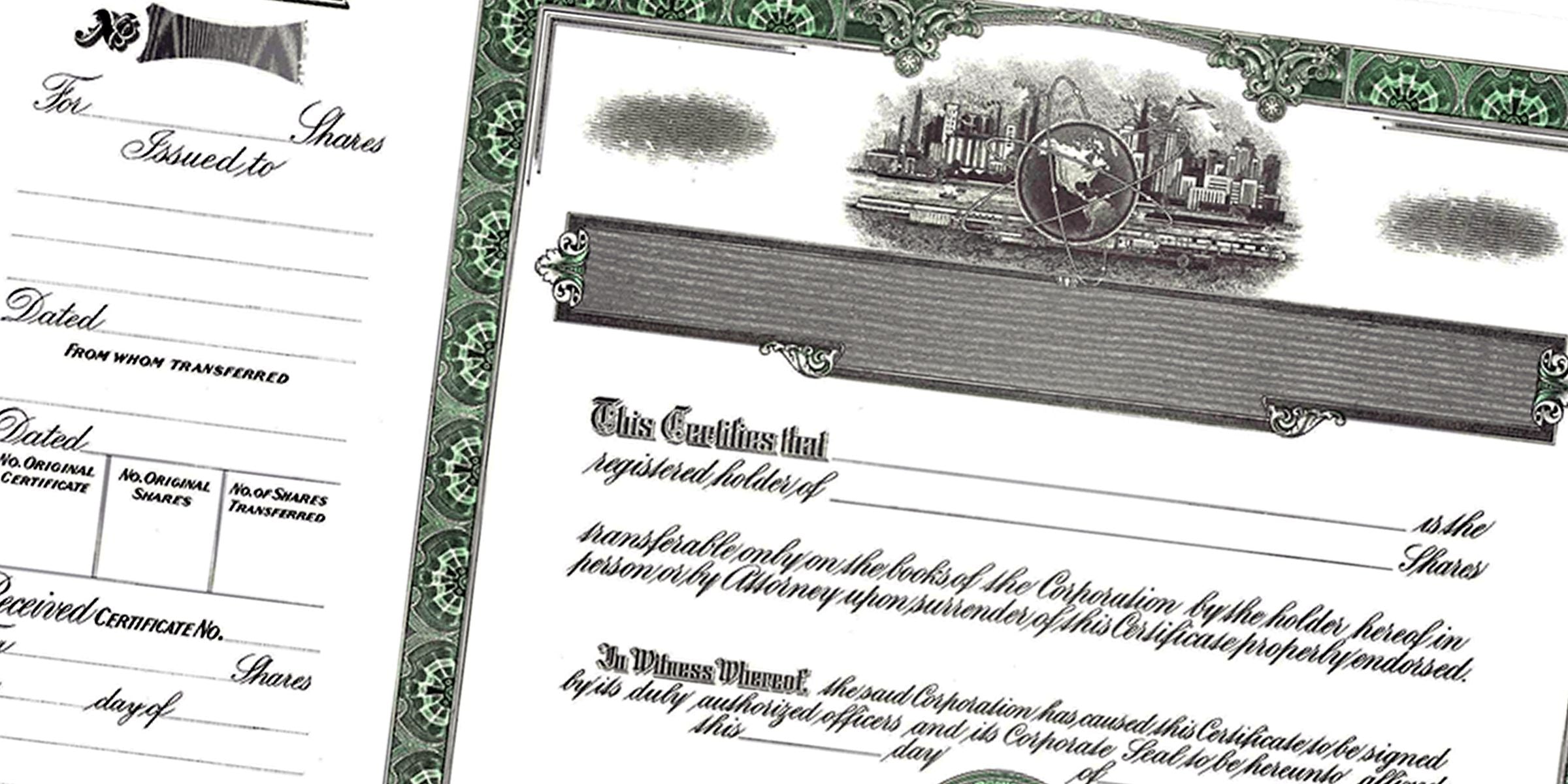
When you’re preparing a document that represents ownership and prestige, choosing the right stock certificate font can make all the difference. A clean and stylish typeface doesn’t just look nice, it also sets a professional tone for your company. After all, your certificates aren’t just pieces of paper, they’re statements about your brand.
Recognize the Importance of Fonts
Fonts influence how readers perceive the legitimacy and authority of the information in front of them. Pick a font that strikes the right balance between formal and inviting. You want it to look elegant without feeling outdated or stuffy. Classic serif fonts (fonts with small decorative strokes) often work well for certificates because they convey tradition and reliability.
Font Factors to Consider
- Readability: Make sure letters are easy to distinguish.
- Style Consistency: Pair heading and body fonts that complement each other.
- Print Quality: Some overly detailed fonts can blur when printed.
Reflect Your Brand Identity
Your certificate font should reinforce your company’s overall aesthetic. If your branding is modern and minimal, a sleek sans-serif typeface might be best. If you lean corporate or traditional, a serif font feels more appropriate. The goal is to match the look and feel of your other official materials so everything appears cohesive.
Simple Ways to Align Fonts
- Use the same or similar fonts across brochures, letterheads, and websites.
- Incorporate brand colors in any accent text or lines on the certificate.
- Keep your typography consistent over time for easy recognition.
Balance Security and Appearance
Many businesses overlook the security aspect of their certificates. While a fancy typeface is eye-catching, you also want a design that’s tough to replicate. Text with distinctive flourishes or watermark effects can deter forgery. Security papers, emblems, or embossed seals (raised impressions) further reinforce authenticity.
Security Details That Improve Trust
- Embedded holograms or micro-text on the document.
- Official stamps or seals that confirm validity.
- Lace borders that are difficult for counterfeiters to copy.
Rely on Expert Suppliers
Sometimes, finding that perfect typeface is simpler when you work with professionals who’ve been in the industry for years. At Acorn Sales, we’ve served businesses since 1964 with stamps, seals, incorporation products, and stock certificates. We understand how crucial the right design elements are. Our quick turnaround and stellar customer service mean you’ll get top-quality results, fast.
Benefits of Professional Support
- Guidance on font choice to match your brand image.
- Options for adding security features like embossed seals.
- Access to a wide range of certificate styles for every business type.
If you want to take presentation a step further, you can also look into our framed stock certificates. Framing your certificates adds that extra polish, helping them stand out on display.
Summarize the Benefits
Choosing a suitable font for your stock certificates enhances brand consistency, deters unauthorized duplications, and gives recipients a positive impression of your business. It doesn’t have to be complicated. Focus on readability, style, and security measures. By blending these elements, you’ll have certificates that look sharp and stand the test of time.
By focusing on a balanced, secure, and brand-aligned stock certificate font, you’ll ensure your documents stand out with class and confidence.
Frequently Asked Questions
Can I Use Any Font for My Stock Certificates?
Technically, yes. But using a well-chosen, professional typeface boosts legitimacy and readability. Avoid overly decorative fonts that can hinder clarity or appear unprofessional.
What Is the Best Font Size?
Aim for a font size that is legible from a normal reading distance, usually between 10 and 12 points for body text. Key headings might be slightly larger to draw attention.
Should I Incorporate Color in My Stock Certificate Font?
A subtle color can add flair, but be careful with bright hues that can clash or look distracting. Gentle shades that align with your brand often work best.
Will a Decorative Font Affect Authenticity?
A decorative font can add personality, provided it’s still secure and easy to read. If you opt for flair, ensure you pair it with crisp design elements and security features.
Does the Type of Paper Matter as Much as the Font?
Yes. Quality paper that supports watermarks or embossing enhancements increases the certificate’s professional feel and security. A beautiful font alone isn’t enough if the paper feels flimsy.
Where Can I Find Help Designing My Stock Certificates?
An experienced supplier like Acorn Sales can guide you through font selection and security features. We’ve been supplying outstanding stamps, seals, and certificates for over six decades, so we know what works best for different businesses.